


Buoyed by low interest rates for the last decade, many property markets have seen substantial price growth since 2010. Experts warned that real estate bubbles—in which the price of assets moved up far beyond their intrinsic value—were forming.
The UBS Global Real Estate Bubble Index analyzes the real estate market of 25 major cities across the globe and assigns them a score between -0.5 to 2.0 to convey bubble risk. The higher the score, the more imbalanced the market is, with those above 1.5 in “bubble-risk” territory.


Low financing costs have been the lifeblood of global housing markets over the past decade, driving home prices to dizzying heights. However, the abrupt end of the low interest rate environment has shaken the house of cards. On average of all cities, within the past year, inflation-adjusted home prices have seen the sharpest drop since the global financial crisis in 2008. Cities that have been classified in the bubble risk zone at least once in the past three years recorded an even stronger average price decline. However, the impact of higher interest rates has varied markedly across cities, with the price correction depending on several other factors as well.
Where home financing was already at the limit of affordability with low interest rates, higher interest rates almost inevitably led to a slump in local demand. If a market was characterized by a significant decoupling of purchase prices from rents, the rise in mortgage rates shifted demand back to the rental market. In housing markets that were predominantly short-term financed, owner households immediately felt the higher financing costs and were forced to accept lower prices when selling. Where buy-to-let became popular during the low interest rate period, fire sales due to higher interest rates and slumping profitability intensified a correction. 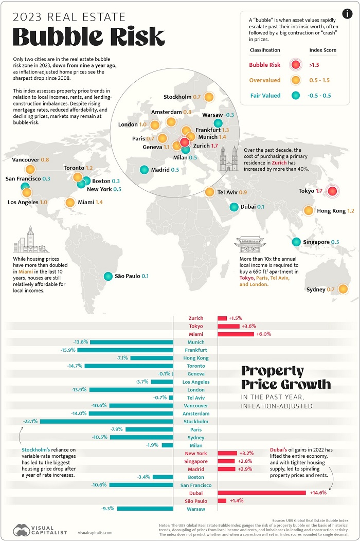 We visualize the data in the above map, along with charting the real property price changes in the last year.
Source: www.visualcapitalist.com